 |
|


 Jun 30, 2011, 06:28 PM // 18:28
|
#821 | |
|
Site Contributor
Join Date: Aug 2010
|

Quote:
And OMG, I totally love the idea of a female charr engineer steam-punk style!! |
|

|

|

|
Jun 30, 2011, 07:53 PM // 19:53
|
#822 |
|
Krytan Explorer
Join Date: Sep 2008
|
@IH hmmmmmm, its a cool idea, but not really too eager to draw fur atm >_< (thats kinda painful process lol)
@Aero thanks ^_^ i did a sketch of a human engineer with a lot of steam punk details (somehow i imagine her to be in one of those airships) @Mina ooh, sorry to hear you got sick, i hope you feel better soon love *hug* thanks. @Guy thank you *kiss* @Thistle ahhh, idk, charr anatomy is scary :O + the fur -_- wip time:  i think her eyes need a little adjustment hehe. I know they don't wear goggles on a video clip but who knows, maybe they got some cool clockwork goggles ingame  I referenced the pistol from this concept art (still don't know if i'll make it blue...) I referenced the pistol from this concept art (still don't know if i'll make it blue...)
|
|
|
|
|
Jun 30, 2011, 08:58 PM // 20:58
|
#823 |
|
Jungle Guide
Join Date: Apr 2009
Guild: Eon
Profession: Me/N
|
doh, lol I did not mean literally sick haha. I meant the 'sickness' of not being able to post as much ^^"
And love the outfit of that WIP so far. I can tell it's gonna be another badass artwork. |
|
|
|
|
Jun 30, 2011, 09:01 PM // 21:01
|
#824 |
|
Wilds Pathfinder
Join Date: Dec 2006
Location: Avatar by unsolvedenigma.deviantart
Guild: Denizens of the Underdark [Nite]
Profession: N/Me
|
O god, Magik + Steampunk = RED ENGINE GORED ENGINE GORED ENGINE GORED ENGINE GOing brilliant. I can't wait to see how this turns out! <3
|
|
|
|
|
Jul 01, 2011, 05:14 AM // 05:14
|
#825 |
|
Desert Nomad
Join Date: Apr 2009
Guild: Trifecta Luminati [TRI]
Profession: W/
|
Awesome brushwork on the Sylvari, Magik. The face paint is a nice touch too. The steampunk pic is looking really promising as well.
|
|
|
|
|
Jul 01, 2011, 06:59 PM // 18:59
|
#826 |
|
Krytan Explorer
Join Date: Sep 2008
|
@Mina oh, lol, well glad to hear that you are not really sick
 thanks thanks @Drelias oh thank you love, you are too kind ^_________^ @Charlie thanks its always a pleasure to receive compliments from a master such as yourself.And now... i need your help guys. I want your honest (and i really mean honest) opinion about next wip: 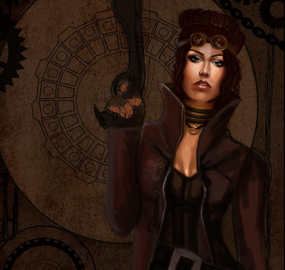 Ok, so : 1) color composition / is it better on this artwork or is it worst compared to my previous paintings? I generally mean skin parts (her face). 2) Technique / does it look better or worse than my previous paintings? Again, attention should be more focused on her face and skin (because i haven't spent more than 30 minutes on her clothing). If anyone can help me out, pretty please? It is super, super important, and i will be forever thankful if anyone can take few minutes to help me out ... |
|
|
|
|
Jul 01, 2011, 07:09 PM // 19:09
|
#827 |
|
Furnace Stoker
Join Date: Jan 2009
Guild: [SOTA]
Profession: D/
|
Hmm. Really, the face looks fine, I think; my only real comment is in regard to colors and that the face looks more pink than the neck and chest (what can be seen). However I wouldn't really say it's incorrect, since faces tend to be redder/pinker in color than the rest of the body (except for the hands, usually) anyway. The forehead tends to have more highlighting than what you have here, though.
The sketch and painting so far look awesome, even though I've never liked the steampunk thing at all. |
|
|
|
|
Jul 01, 2011, 09:52 PM // 21:52
|
#828 |
|
Desert Nomad
Join Date: Mar 2007
Location: UK/Austria
Guild: [bone]
Profession: P/
|
I really like the colour scheme and face - for me it really works. I have to say, it looks perfect on my monitor, and that's not as saturated as others, so perhaps it looks a tad red-ish on other monitors, but for mine it's perfect! the browns are great. I also can't say anything negative about the technique - in fact I think I prefer this (although truth be told I couldn't bet on being able to tell exactly what you've been doing differently). I think looks very realistic in a painterly fashion. This'll be awesome!
The only thing that jumps at me at this stage are the goggles, I think the glasses should be further apart and larger, so they would sit comfortably over the eyes. |
|
|
|
|
Jul 01, 2011, 09:57 PM // 21:57
|
#829 |
|
Jungle Guide
Join Date: Apr 2009
Guild: Eon
Profession: Me/N
|
I really like the color scheme here. It fits the steampunk feel. The skintone is also very realistic color-wise but maybe too smooth (completely understandable because this is not done yet :P) and could probably use some textures/imperfections as part of the finishing touches.
The one thing I noticed so far is that your latter artworks don't have a lot of face variations (I am probably guilty of this too). They seem to be all the same person. Don't get me wrong - all of them look absolutely stunning but maybe adding a bit more variety in facial features could bring more oomph to your works
Last edited by Ravenhawk; Jul 01, 2011 at 10:00 PM // 22:00.. |
|
|
|
|
Jul 02, 2011, 04:05 AM // 04:05
|
#830 |
|
Jungle Guide
Join Date: Jan 2007
Location: The Netherlands
Guild: None
Profession: R/
|
While I like the overall pose and clothing, I really notice you use alot of the same type of faces. I think you should try something different, but then again it usually requires a different pose. But other then that I have nothing else to say but the goggles seem a little small.
|
|
|
|
|
Jul 02, 2011, 09:52 AM // 09:52
|
#831 | |
|
Furnace Stoker
Join Date: Dec 2006
Guild: [Bone]
Profession: Mo/
|
Quote:
About the skin tone then. I think its great. The darkness and hue really fit in the background. Her forehead misses some color though, could use some more red. Also her neck-chin connection looks a bit odd, missing some shadow there. But really, the colors are great! About the technique, well it's hard to base that on just the face  But when I look at the face, it feels like you've adjusted the levels later on. Sometimes if your skin looks smooth and then start adjusting the layers your brushstrokes come out stronger and making you loose the blended feeling. For me, there are always 2 ways of making skin look good. Either really polished (still with hard edge brushes though) or really rough, like adding light with a single stroke (you can see this a lot in more traditional paintings, like the first painting in my fav's on dA). So I would either make the skin more blended or rougher (and the latter is much harder I believe ) But when I look at the face, it feels like you've adjusted the levels later on. Sometimes if your skin looks smooth and then start adjusting the layers your brushstrokes come out stronger and making you loose the blended feeling. For me, there are always 2 ways of making skin look good. Either really polished (still with hard edge brushes though) or really rough, like adding light with a single stroke (you can see this a lot in more traditional paintings, like the first painting in my fav's on dA). So I would either make the skin more blended or rougher (and the latter is much harder I believe )Beside that, perhaps you can lighten up her nose a bit, the sides of it are really dark. Not saying its necessary, but it might give a more soft feeling. Edit: the comment above was written from my laptop. Now I see it on my iMac, the colors look a lot more saturated. I liked my laptop version better, it seems a bit to bright on the iMac. And I believe my iMac is more accurate, so perhaps try removing some of the color. Play around with layer adjustments and the bunch. I do that all the time while painting. |
|
|
|
|
|
Jul 02, 2011, 10:53 AM // 10:53
|
#832 |
|
not so much fell as.....
Join Date: Jan 2009
Location: UK
Guild: bone
Profession: R/
|
I love it, I agree with Morag about the goggles.
|
|
|
|
|
Jul 02, 2011, 02:39 PM // 14:39
|
#833 |
|
Jungle Guide
Join Date: Jul 2009
Guild: The Kurzick Mob [Mob]
Profession: R/
|
On my screen, the face does look bright. But it's hard to tell if that's a bad thing because the rest of the piece isn't finished
I don't think it'll look wrong/bad because I would assume skin is more reflective than leathers and cloth. Colour-wise I don't think it looks bad at all. I think it fits in well with the whole colourscheme. It might be a tad more orange than red, but it just looks like shes tanned. Don't know how to comment on the technique. But it all looks nice And I agree with Tommy, IH, and Mina about the faces. A little variety never hurts 
|
|
|
|
|
Jul 02, 2011, 06:04 PM // 18:04
|
#834 |
|
Krytan Explorer
Join Date: Sep 2008
|
thanks guys, you are the BEST!!! anyway, Im doing coloring completely differently than my usual methods. Im trying out new stuff, because i re-watched that massive black dvd and between that guy's yapping about how he doesn't use references and how his wife supports him ( and for the 4 hours he babbled about everything except for the actual painting -_-) i've picked up a few tricks which i want to put on the test. I usually prepare color palette before the actual painting begins and i wanted to see if i can get it right if i don't do that first. Also, im not really that much concerned about her face being similar to emerald painting, i've seen myself repeating before, especially when i don't use any reference, faces turn out quite similar... And heres a wip: 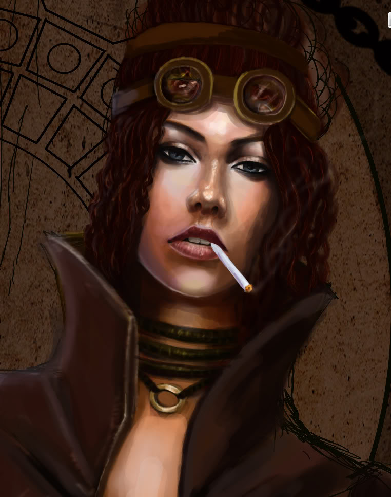 I fixed her goggles, and more work done on her skin... |
|
|
|
|
Jul 02, 2011, 06:23 PM // 18:23
|
#835 |
|
Jungle Guide
Join Date: Jan 2007
Location: The Netherlands
Guild: None
Profession: R/
|
Looks better, I think the sigaret changes alot.
|
|
|
|
|
Jul 04, 2011, 08:06 AM // 08:06
|
#836 |
|
Desert Nomad
Join Date: Apr 2009
Guild: Trifecta Luminati [TRI]
Profession: W/
|
Wait a tick, did you happen to use Megan Fox's face as a reference here?
|
|
|
|
|
Jul 04, 2011, 12:56 PM // 12:56
|
#837 | |
|
not so much fell as.....
Join Date: Jan 2009
Location: UK
Guild: bone
Profession: R/
|
Quote:
what is it with cigarettes? Am I the only one who thinks they look ugly? |
|
|
|
|
|
Jul 04, 2011, 05:13 PM // 17:13
|
#838 |
|
Jungle Guide
Join Date: Jan 2007
Location: The Netherlands
Guild: None
Profession: R/
|
I think the cig fits here well, looks pretty stylish.
|
|
|
|
|
Jul 05, 2011, 09:12 AM // 09:12
|
#839 |
|
Jungle Guide
Join Date: Mar 2010
Location: Denizen of Tyria since Feb. 2009
|
Gah, can't believe how long it's taken me to check back in here. Love-love-loved the Sylvari. Amazing to see the changes in the final result compared to the last WIP.
There's something kind of irking me about your steampunk gal. Maybe it's my imagination, but there's something about the faceshape that's kind of suggesting a perspective/pose that isn't really being fully realized. "Wut?" Okay, there are aspects that are suggesting that her head is kind of tilted back in a "looking down her nose at you" kind of way... like this, but not as extreme (this one is tilted much further back and off to the side...it's as close as I could find to illustrate my point ):But the rest of the face doesn't follow that idea. I'm just getting a not-totally-in-agreement-perspective vibe. Am I seeing things? Is anyone else seeing it? Maybe it's the tiny goggle thing that everyone else has pointed out that's giving me that feeling. |
|
|
|

|
Jul 10, 2011, 03:17 PM // 15:17
|
#840 |
|
Krytan Explorer
Join Date: Sep 2008
|
@IH yes, i think so too.
@Charlie no (i didn't use reference for the face at all). @Aero well, it fits the picture. Personally, i haven't lit single cigarette in my entire life, and no, i don't support them. @Star hmmmm, i will look into it, thanks for pointing that out. |
|
|
|
 |
|

«
Previous Thread
|
Next Thread
»
| Thread Tools | |
| Display Modes | |


 Linear Mode

|
|

All times are GMT. The time now is 02:26 AM // 02:26.
